

Jun - Jul, 2021
Mobile App
Redesign
Ruilu Chen
Jingwen Li
Pei Li
Wenjie Wu
Usability test
sketch
Wireframe
Prototype
Motion
Branding
Dragon Baby is a fresh grocery delivery startup based in Bay Area. Our team conducted usability test and redesigned the shopping experience to relieve the customer service stress and boost potential revenue.

In the kick off meeting, stakeholders shared the following information:
A. Shipping fee and delivery time are major concerns of customers
B. We provide free ice bag, but not too many people discover it
C. Most of new customers are referred by friends or social medias


We defined two typical user groups to understand different use cases.


Combining the information from stakeholders and user needs, we designed 4 main tasks for the moderated usability test. The insights could be categorized into three aspects.


7/7
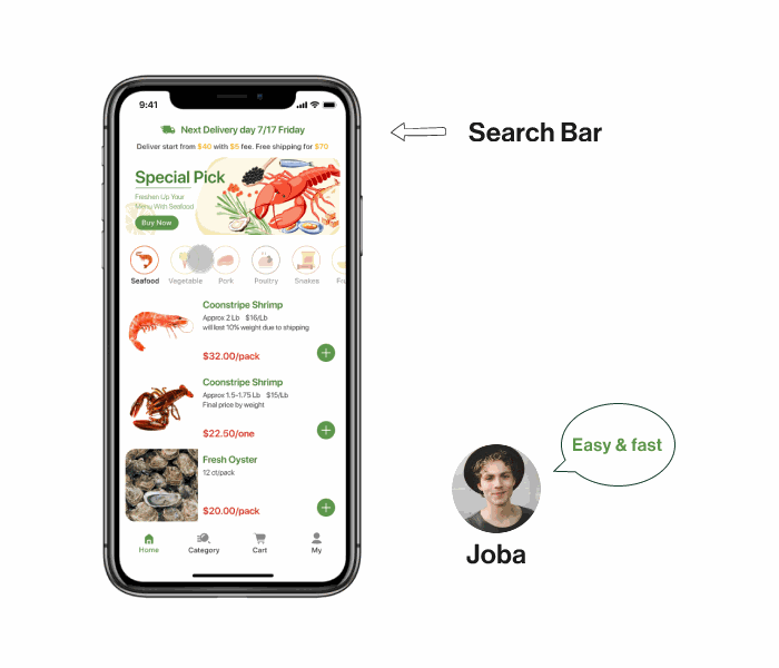
Complained no search function
6/7
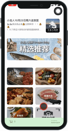
noticed products mis-categorization

6/7
Went back and forth to check price and shipping rules
5/7
Misunderstood the shipping rule

7/7
Didn’t know delivery dates at checkout
3/7
Found hidden dates in homepage notice


"I just want to buy some ham, however it's not in 'Pork Section'. Since there's no search function, I had to browse in the 'All Product' list."

Simply provide a search function could meet users' needs and reduce task time significantly.
The shipping rules are confusing and hidden in check out page. 5/7 participants mistook it for “free shipping over $40”, and complained they would quit if it had not been a usability test.

"The shipping rules are too tiny to see. I had to go back and forth to check the total price ."

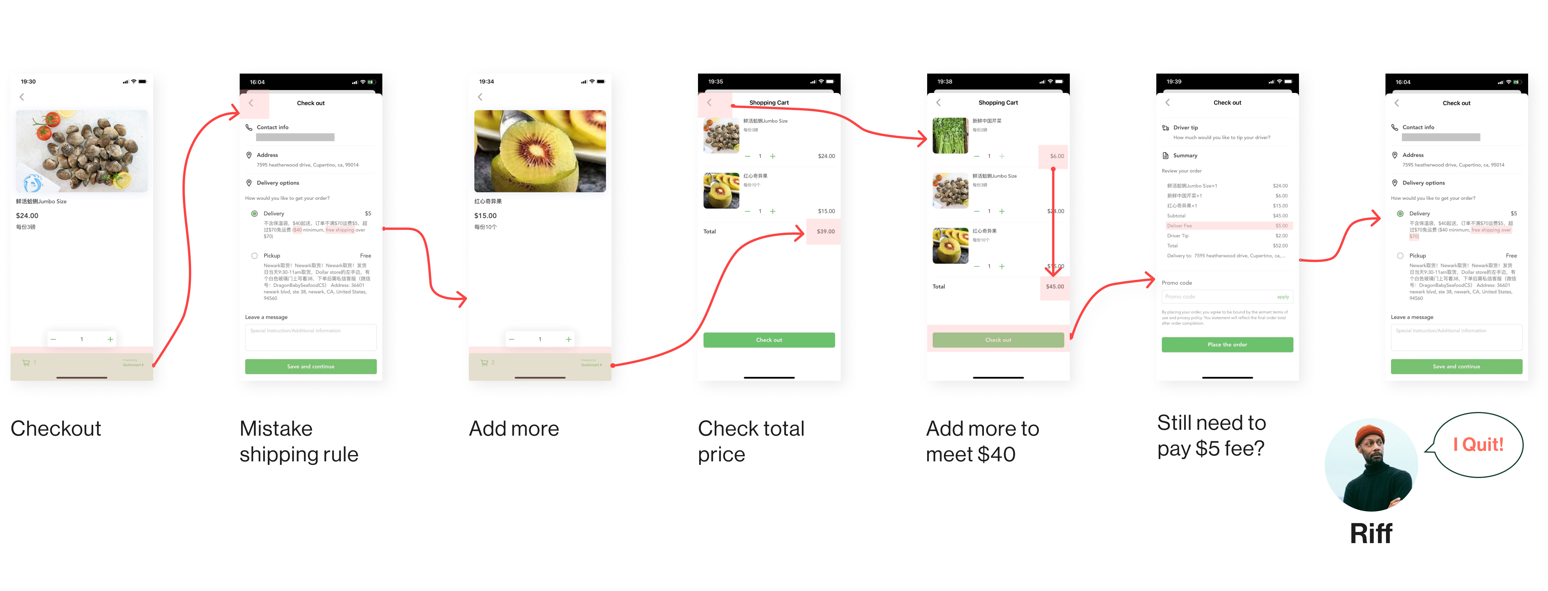
- Do clients want to see shipping rule all the time?
- Is it necessary to display all the time how much more they need to spend for free shipping?

- Delivery date is more important than shipping rules
- People don’t want to be informed “how much I’m short for free shipping” all the time

- Understand the shipping rules and shipping fee at first
- Know how much is short for free shipping, so may add more to cart to meet $70 free shipping line
- Smoothly proceed to checkout

People can't find the delivery date in checkout page or summary. It's hidden in homepage banner, mixed in the long description of "About us".
Users thought they will get their orders right away, actually Dragon Baby only deliver on Wed, Sat and Sun.
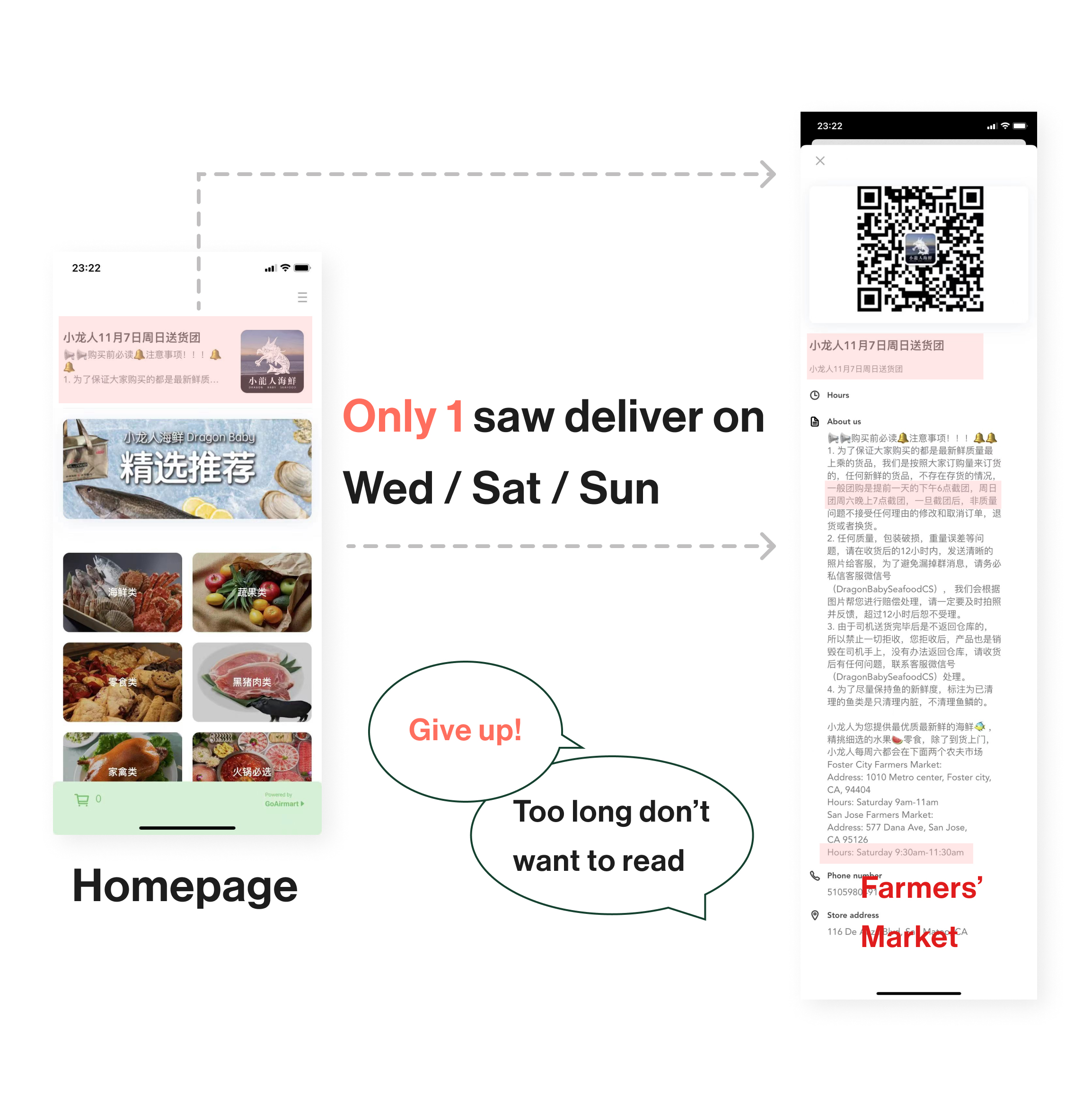
People want to know the delivery availability before and during checkout. So we bring delivery dates to the right time & place.

Free ice bag was on the first place of all product, however, 6/7 participants didn’t discover ice bag at homepage. To increase its discoverability, we moved this good service to checkout page .

Search function enables customers to purchase specific items faster than ever.

Subcategories help customers locate and browse with a purpose efficiently. Moreover, it's scalable for Dragon Baby's growing business.

Current version needs manual address input, and no mechanism for error prevention. Auto-filled address is a technically viable solution. And customers will be notified if out of delivery area.

The new product description page rearranged the visual hierarchy of the content by the results of usability test and interview. Follow-up interviews proved that the new product page was more digestible for information acquisition.


In the follow-up tests and interviews we validated our design with the metrics set before. The new version achieved significant improvement.


Customer service received less pressure from inquiries about shipping fee and delivery dates. More people chose "ice bag service" and had positive feedback.
Although some of our design proposals haven't been implemented because of technical limitations and budget, the new design illustrates the future direction of Dragon Baby's app while considering user experience, aesthetics, and business goals.

- As a team we took turns taking notes during the meetings; and I assigned tasks to members. This documentation method kept everyone on the same page.
- We decided to use a mixture of mid-fi and low-fi presentation in meeting to accommodate the fast pace of design sprint. It's efficient in retrospective since low-fi guarantees speed and mid-fi provides resolution on some details.


