

Jun - Aug, 2021
Mobile App
Redesign
Ruilu Chen
Jingwen Li
Yijing Han
Yunlei Li
Man Yang
Dan Zhang
Interview
Heuristic Evaluation
Usability Test
Sketch
Wireframe
Prototype
As a pioneering in Chinese influencer social media, Wisdom Planet operates as a subscription-only platform for sharing of knowledge, experience, general advice and training programs, and has successfully attracted 30 million users since 2016.
However, in 2021 the project manager noticed low engagement of newsfeed, which undermined the subscription renewal rate. Under the circumstance, the task for our team was to redesign a joyful and personalized browsing experience for newsfeed, and motivate users to participate more in club activities.
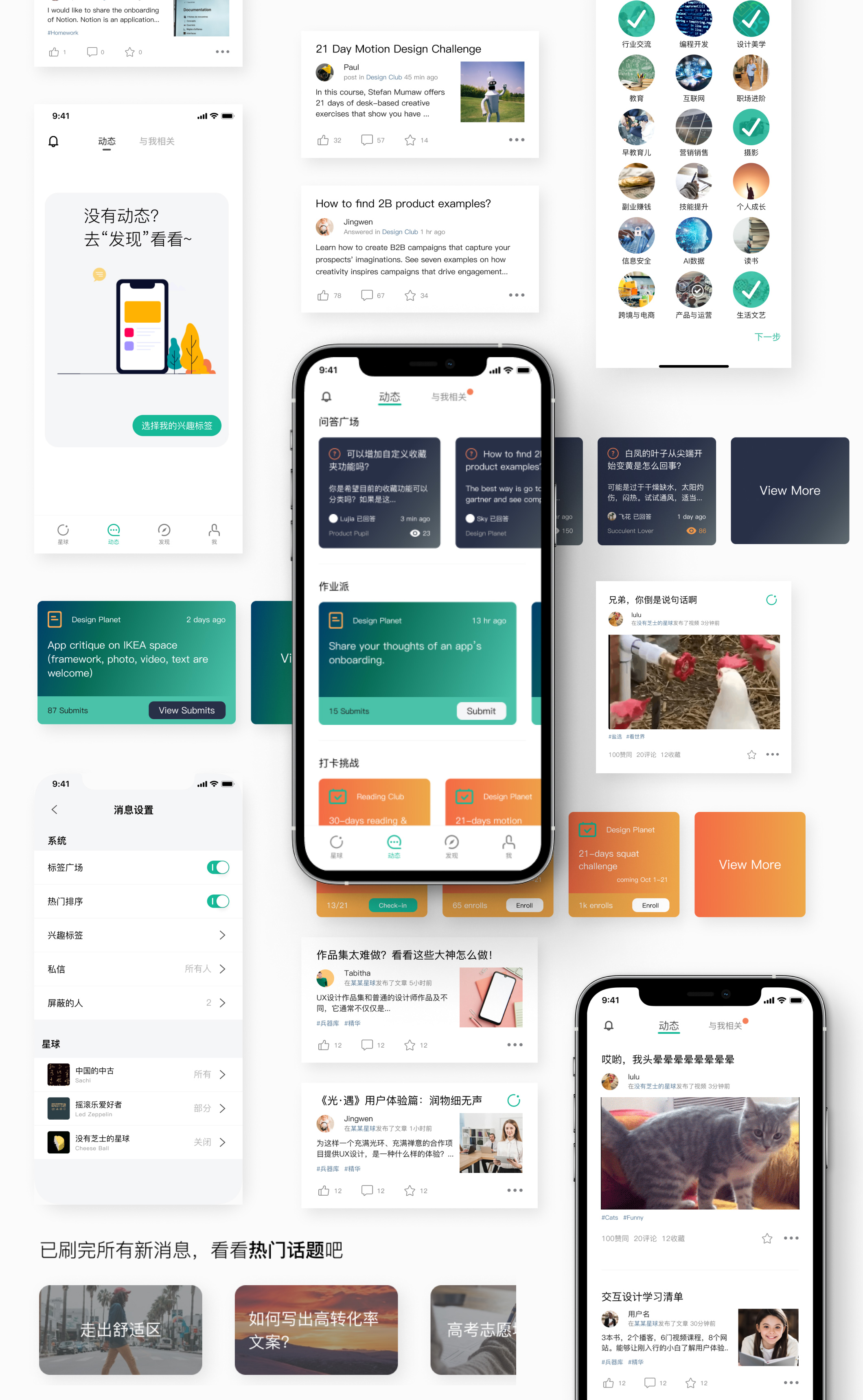
Social media influencers host clubs, share experiences, and make a profit through membership fee on Wisdom Planet.

With the hyper activity of clubs, the newsfeed appeared to be cluttered, causing low readability which turned users away.


“My Moment is totally blank at first. I don’t know what it is for a long time.”
“There’s few updates in my Moment. I would like to see more relevant topics or I lose passion.”
Jordan joined only one club to learn photography. There’re few updates in this club, so Jordan has nothing to read in Moment.

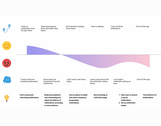
When and where do I want recommendations?
After I catch up with all the updates and still want to see more.

“Every post looks the same. No title, no sorting.”
Ada usually reads the daily updates in commute. Too many new posts popped up as she joined several clubs. Her intention was not to miss any good post, but it's difficult to check all updates.

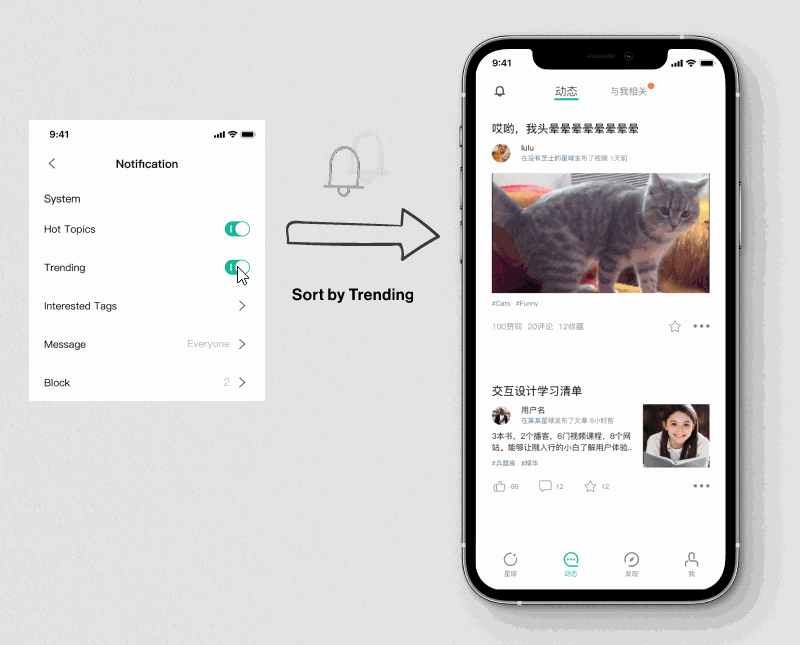
In usability tests, we found users were highly into the comprehensive sorting. What if we present it directly?


1. We implement “Trending” for sorting
without adding addition tabs on the surface.
2. People can also
switch off “Hot Topics”
since it’s already too much to read.
1+2=The personalized settings bridge the gulf of newbies and power users.

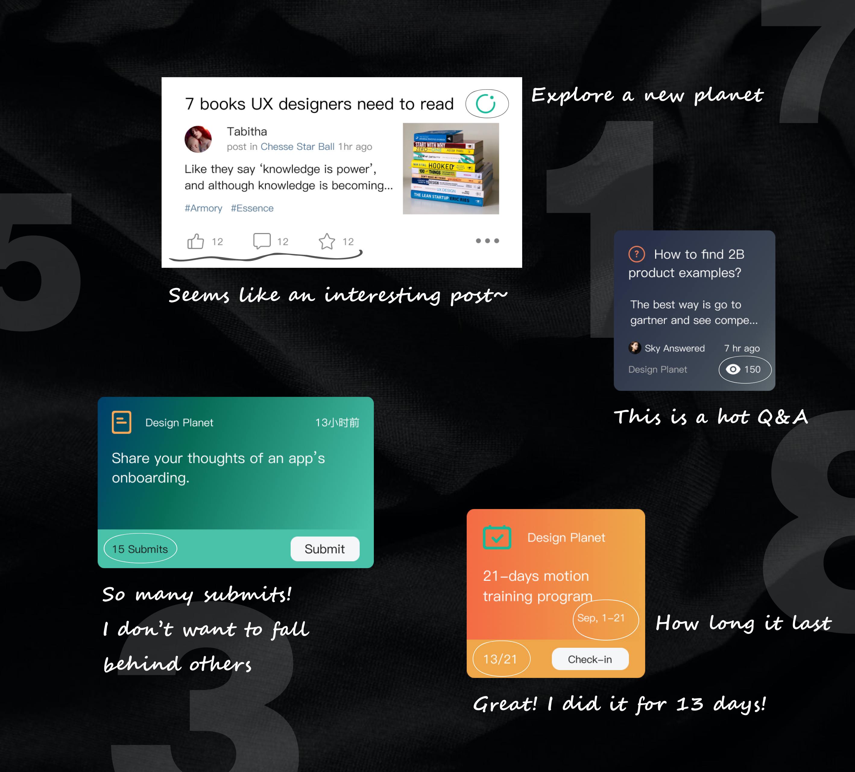
Posts related to practice attract more attention. However, accessing them requires a few more steps because the page is filled with wanted and unwanted posts.
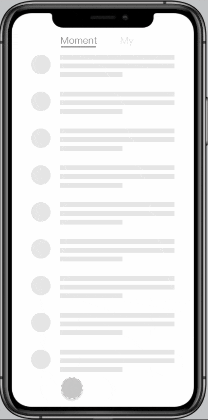
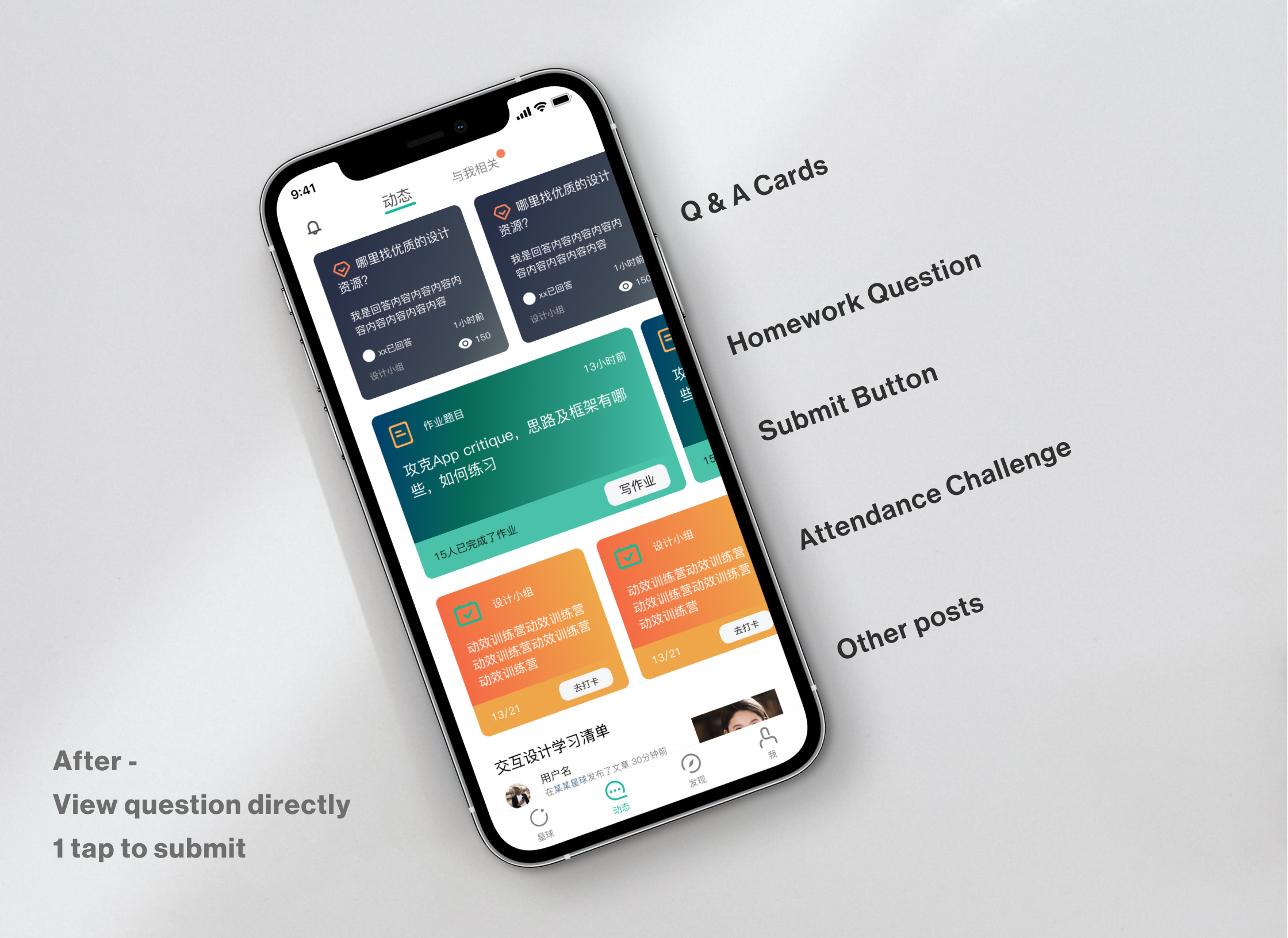
Before -
3 taps to see question and submit
Let's just show the entry on top of Moment! Make it easy to access.
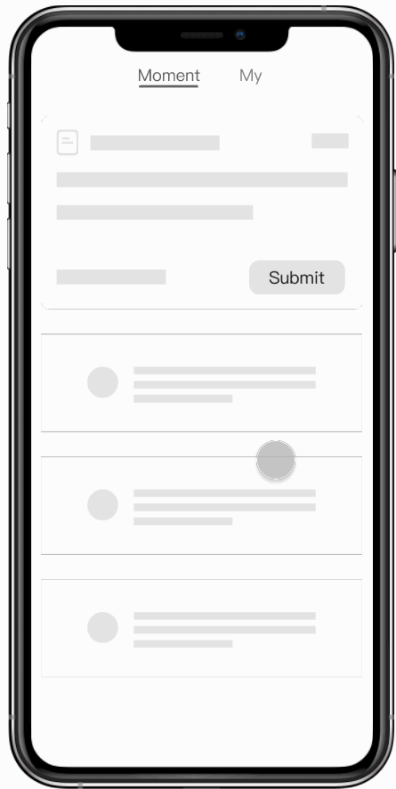
After -
View question directly
1 tap to submit
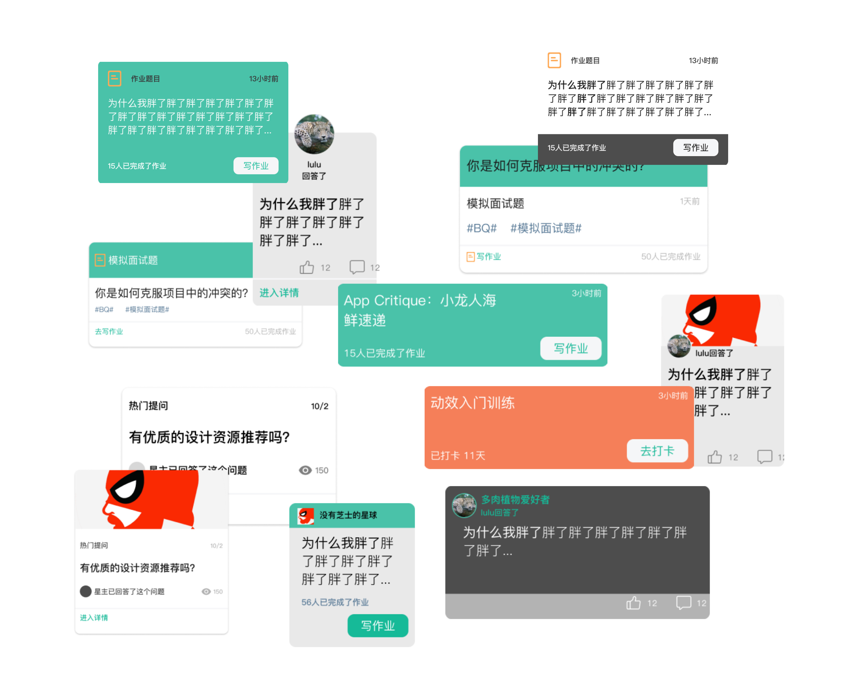
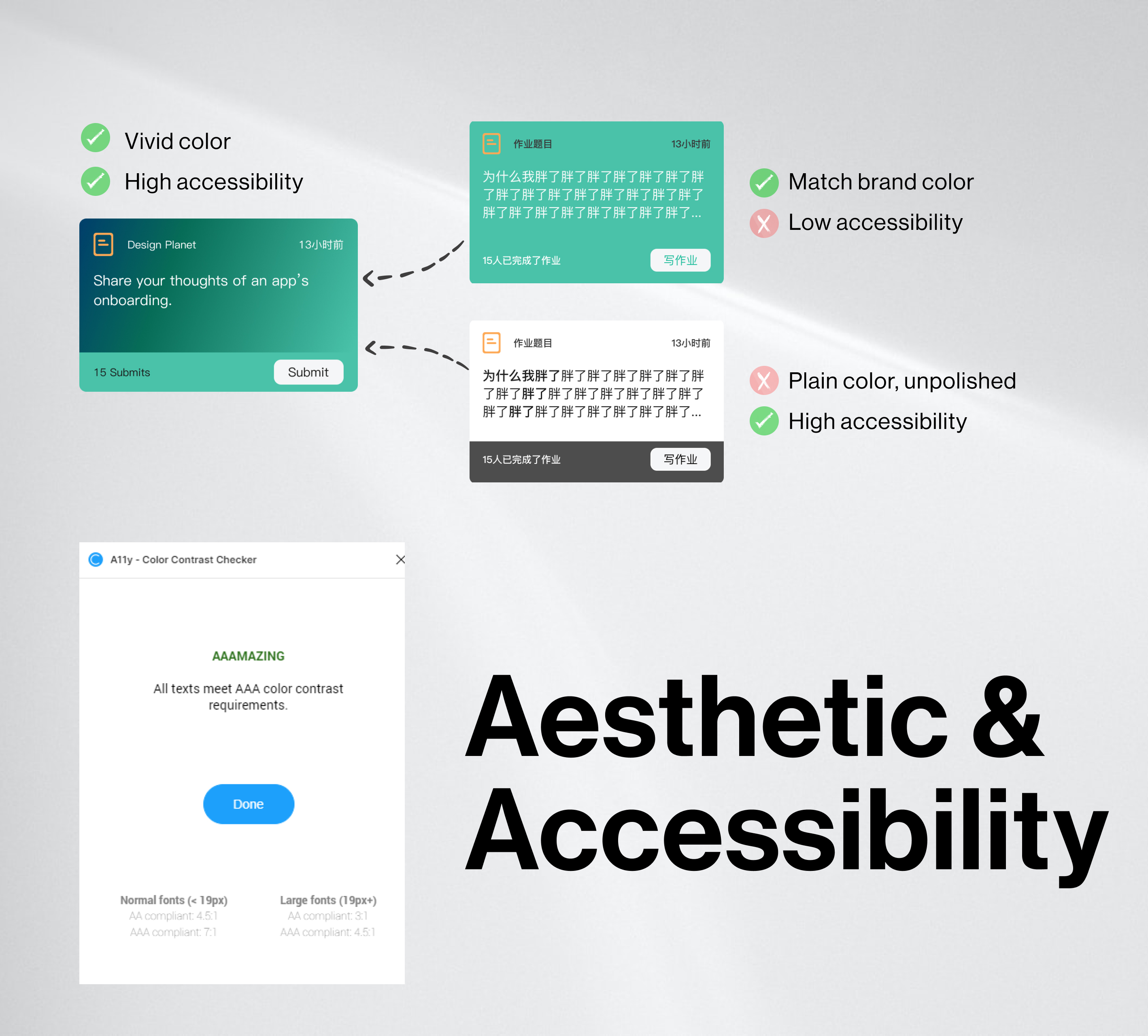
A good shortcut card should look attractive and easy to read.
Take a glance and I know I've read this one!
It's a natural instinct for human beings to catch up with other people.
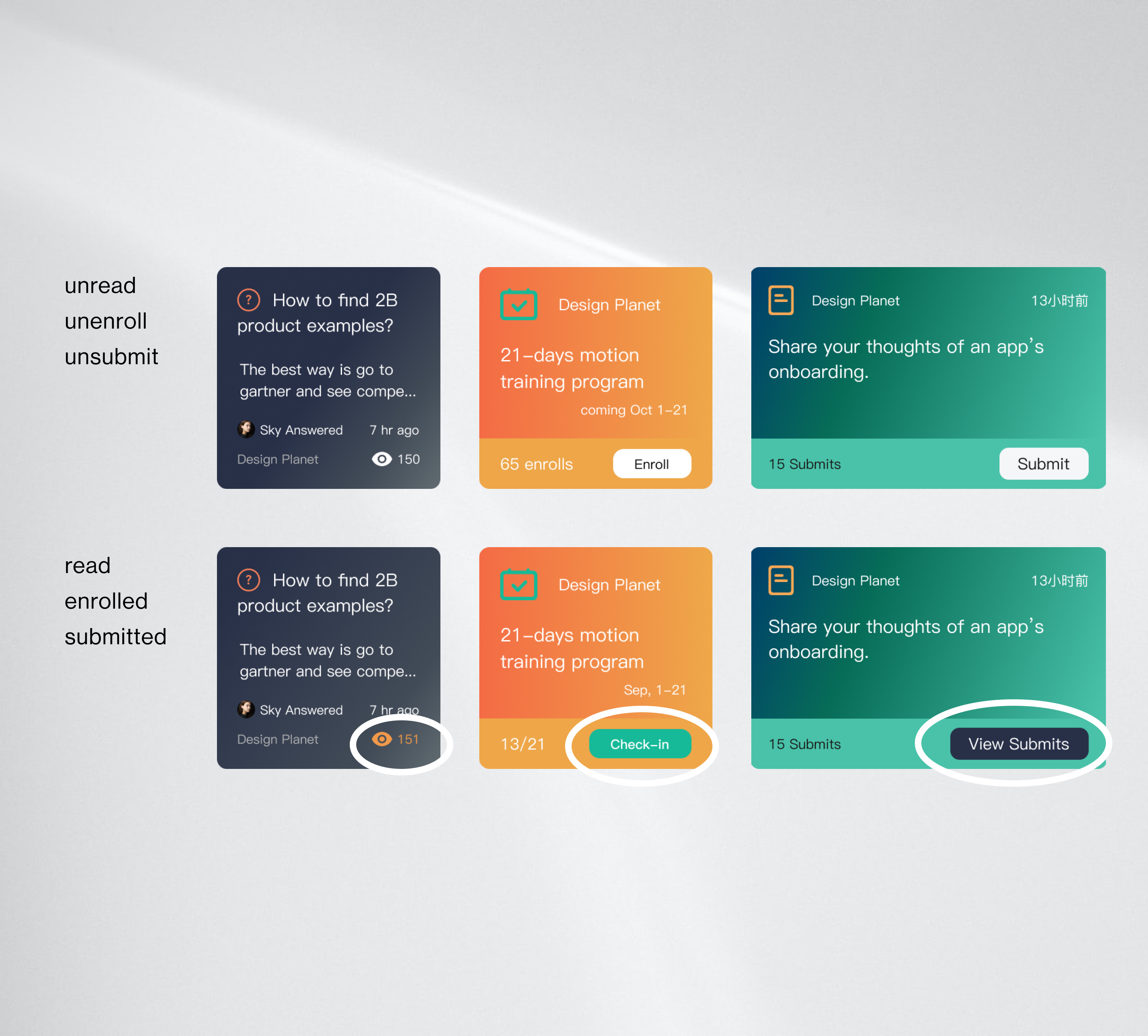
In the final version, users can access core posts through shortcut cards, engage more with the new visual modifications, and personalize their preference in settings.

To understand and decompose the project manager’s task, we went through heuristic evaluation, interviews and desktop research. The design kept iterating through prototypes and lightweight usability tests.


In the final test, we got 57% increasing in finding homework, Q&A and daily challenge. Most of our participants thought the color is very inviting.
The CEO of Wisdom Planet expressed interests in the shortcut card and would implement it in the next pilot test.


